Color Psychology in Product Photography is one of the most powerful yet underused strategies in e-commerce today. Colors in your product images do far more than just look appealing — they shape how customers feel, think, and decide. Every tone, shade, and background choice sends a subconscious signal to the buyer’s brain, influencing trust, desire, and purchasing decisions. Whether you are launching a new product brand or scaling your existing online store, understanding and applying color psychology can dramatically improve engagement, clicks, and conversions.
For e-commerce brands, this becomes even more important because customers rely entirely on visuals when evaluating a product. A photography studio that understands color composition, lighting, and brand identity can help translate your product’s value into an emotional connection. MN Photography, based in Udaipur, is known for focusing on visual storytelling and color accuracy that enhances product appeal across digital platforms.
Understanding Color Psychology in Marketing
Color psychology is based on the idea that different tones evoke different emotions. For example:
🔴 Red communicates urgency, passion, or boldness.
🔵 Blue often conveys trust, calmness, and reliability.
🟢 Green suggests balance, freshness, or sustainability.
🟡🟠 Yellow and Orange can express warmth, excitement, and energy.
⚫⚪ Black, White, and Neutrals are associated with sophistication and minimalism.
Brands across the world use color intentionally to build recognition, evoke emotions, and influence buying behavior. The same logic applies to product photography—your color choices must enhance your brand message.
Why Color Matters in Product Photography
The first impression of a product is visual, and color is one of the first things a viewer notices. Accurate and appealing color presentation:
🤝 Builds trust in product quality
💎 Makes products look more premium
🧵🔍 Helps customers understand texture, material, and finish
📦⬇️ Reduces product returns caused by inaccurate representation
Different tones can also influence how your product is perceived—soft neutrals suggest luxury or handcrafted elegance, while bold saturated tones may create a youthful or energetic brand personality.
How Color Influences Consumer Behavior
Colors do more than decorate—they guide buying decisions. Bright, vivid colors tend to attract attention, while subtle tones create calm and comfort. Cultural backgrounds, personal preferences, and gender can also influence how customers interpret color.
Research in e-commerce consistently shows:
👀📸 Products photographed with appealing color contrast get more clicks
🖼️🧭 Color-coordinated product galleries result in higher browsing time
🎨💡 Visually consistent brand palettes improve customer recall and loyalty
This means your color choices should be thoughtful and aligned with how you want your customers to feel.
Choosing the Right Colors for Product Photography
To make your product stand out while staying visually balanced:
🔥❄️ Choose Warm or Cool Tones Based on Mood
Warm colors feel energetic, while cool tones feel clean and calming.
🖼️✨ Match Background to Product Personality
Minimal backgrounds for luxury items, bold setups for trendy youth brands.
🚫🎯 Avoid Distracting Elements
The product should remain the main focus — not the backdrop.
⚖️👀 Use Contrast Wisely
Contrast helps shapes and textures pop without overwhelming the eye.
This is where creative direction makes a major impact.
Color Psychology Across Product Categories
Different industries use color differently:
👗 Fashion & Apparel — expressive tones that match brand mood
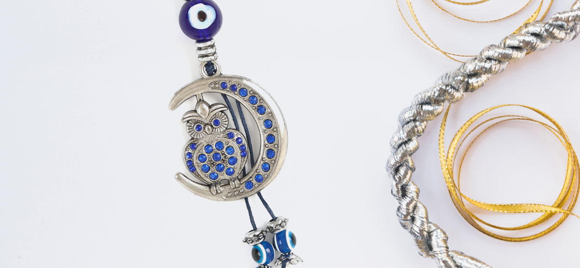
💍✨ Jewelry & Luxury Goods — soft neutrals to highlight shine and craftsmanship
🍽️🥤 Food & Beverage — warm and vibrant colors that emphasize freshness and appetite
🛋️🏡 Home Décor & Lifestyle Products — earthy and neutral palettes to create comfort and elegance
The right palette supports your brand identity while making your product visually irresistible.
Background and Lighting: Bringing Color to Life
Even the best color choice falls flat without proper lighting. Lighting determines:
💡 How accurately the color looks
🎨 Whether textures appear rich or dull
✨ If highlights and shadows enhance the product or distract
Studios use softboxes, diffusers, and reflectors to ensure colors stay true and details stay sharp.
The background also plays a key role:
⬜ Neutral backdrops keep the focus on the product
🎯 Clean and controlled lighting prevents color distortion
Together, lighting and background help a product look real, attractive, and premium online.
How MN Photography Uses Color Psychology Effectively
MN Photography ensures every product looks visually appealing and emotionally impactful by carefully balancing color, lighting, and background. Their approach creates a clean, premium, and consistent brand feel across all platforms.
They focus on:
🎨 Color-coordinated setups that match the brand identity
💡 Controlled lighting to maintain true and accurate product colors
🖼️ Thoughtful backgrounds that highlight the product without distractions
🛠️ Natural editing that enhances clarity and mood while keeping authenticity
The result? Polished, cohesive, and emotionally engaging visuals that strengthen brand perception and attract customers.
Common Color Mistakes to Avoid
Choosing the right colors is essential, but avoiding common mistakes is equally important. Poor color handling can make products look unrealistic and harm brand trust. Here are errors to watch out for:
🚫 Over-editing that alters the real product color
🎭 Clashing colors between the product and background
💡❌ Bad lighting causing unnatural color casts
📸🔁 Inconsistent tones across catalog images
Fixing these issues ensures your visuals feel professional, believable, and consistent — helping customers trust your brand and your products.
Enhancing Color in Post-Production
Editing is the final step that makes product colors look true-to-life and visually attractive. The goal isn’t to change the product — but to refine and enhance what the camera captured.
Key adjustments include:
⚖️ White Balance Correction — ensures colors look natural and accurate
🎚️ Saturation & Vibrance Control — enhances tone without making colors look artificial
🌗 Contrast & Exposure Adjustment — adds depth and clarity to product details
🎨 Tone & Color Grading — keeps the overall look consistent with the brand style
🖥️ Calibrated Screens & Pro Software — ensures colors stay accurate from editing to final delivery
When done right, post-production makes images polished while staying honest to the real product — helping customers trust what they see.
CONCLUSION: COLOR STRATEGY THAT DRIVES VISUAL IMPACT & SALES
Color in product photography goes far beyond aesthetics — it shapes perception, influences buying decisions, and builds brand trust. Whether you’re selling fashion, jewelry, cosmetics, home décor, or lifestyle products, choosing the right color palette and lighting setup can dramatically improve how shoppers connect with your brand online.
When you work with Product Photography Experts, every visual is crafted with strategy. From accurate color representation and clean backgrounds to balanced lighting, every detail matters. Thoughtful color psychology helps:
✅ Make your products look premium and realistic
✅ Build emotional connection and trust with shoppers
✅ Increase product clicks, engagement, and conversions
✅ Reduce customer dissatisfaction and returns caused by color mismatch
✅ Strengthen overall brand identity and consistency across e-commerce platforms
In today’s competitive digital marketplace — especially on platforms like Amazon, Flipkart, Myntra, Shopify stores, Instagram shops, and D2C websites — high-quality, color-accurate product photography is no longer optional. It is a strategic advantage that boosts visibility, credibility, and sales.
MN Photography, known as Product Photography Experts in Udaipur, brings brand-focused color styling, controlled studio lighting, expert editing, and visual storytelling together to help products stand out and resonate emotionally — whether the goal is luxury branding, vibrant retail appeal, or minimal modern aesthetics.
Ready to make your products pop and your brand unforgettable?
Get a color-optimized product photoshoot in Udaipur with MN Photography and elevate your visual presence with clarity, creativity, and conversion-focused content.
Your products deserve to look as good online as they do in real life — and the right colors make all the difference. 🌈📸
FREQUENTLY ASKED QUESTIONS (FAQs)
Q1. What is color psychology in eCommerce?
Ans. Color psychology in eCommerce is the use of colors to influence how shoppers feel and decide. The right colors in product images build trust, attract clicks, and directly improve conversions.
Q2. What is the best background color for product photography?
Ans. Pure white is the most universally preferred background — it keeps focus on the product and is mandatory for Amazon listings. Black works for luxury items, while pastels suit beauty and lifestyle products.
Q3. Why is color accuracy important in product photography?
Ans. Inaccurate colors lead to customer disappointment, negative reviews, and product returns. Accurate colors build trust and ensure the product looks exactly the same in real life as it does online.
Q4. What is color grading in product photography?
Ans. Color grading is the process of adjusting the overall tone and mood of product images during editing. It ensures all catalog images look visually consistent and on-brand across all platforms.
Q5. How does visual branding for eCommerce help my business?
Ans. Consistent colors, backgrounds, and editing style across all product images build brand recognition, look more professional, and make your store stand out in crowded marketplaces like Amazon and Flipkart.